The branding for Vijay Bhoomi University was a project that we loved doing. It was something we knew how to do as we have been evolving with the branding of educational institutions ever since our inception. We went through many different options AND ITERATIONS for the logo.
Every logo we design follows some basic principles. It was no different for VBU. Keeping its unique usage in consideration, we set out to design a logo.
It has a form reflecting its constituents as well as the boldness and clarity to stand out among other logos.
It should not lose its form across different media.
It will retain character as much in vibrant colours in digital format as in a black and white photocopy, the logos have been designed to equally stand their weight if reproduced in a single colour as well, the logos presented here keeps these considerations.

After a lot of back and forth we came up with a concept and a design that the institute loved and that we thoroughly enjoyed creating.
We experimented with colours and selected the 4 colours that we felt best represented the brand.
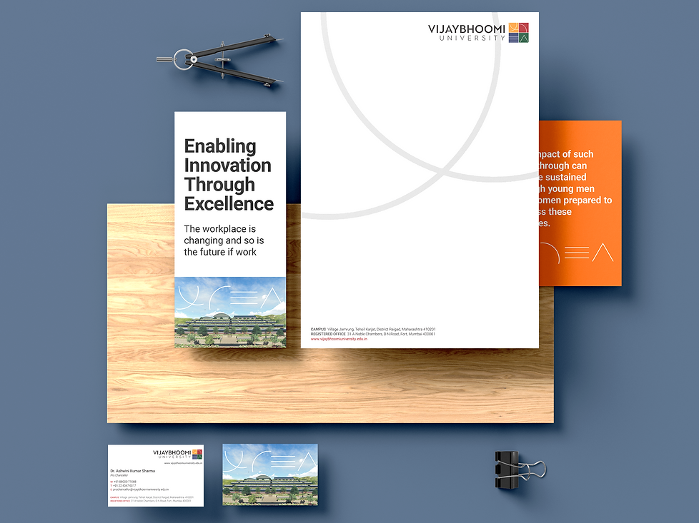
We had to solidify the brand language so that we could design stationery and a flyer to launch their design.